Get all our 34 premium themes worth $2006 at just $99! Limited time offer.
Get It Now 
169,583+
Happy Customers!
Free
$59
Free
Free
Free

Free
Free
Free
Free
Free
Free
Free
Free
Free
Free
Free
Free
Free
Free
Free
$99
Free
Travel Agency Pro
( 41 Reviews )
$59
Free
Free
Free
Free
Free
Free
Free
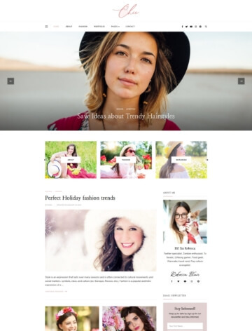
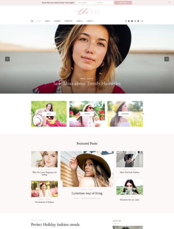
Chic Lite
( 1 Review )
Free
Education Zone Pro
( 43 Reviews )
$59
Construction Landing Page Pro
( 8 Reviews )
$59
Free
Chic Pro
( 15 Reviews )
$59
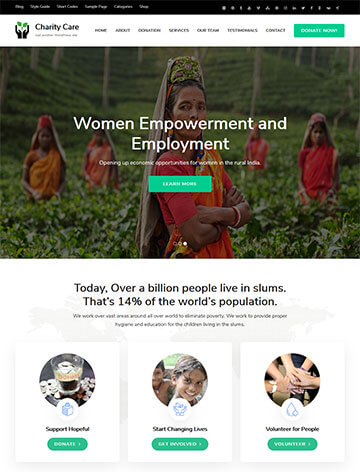
Benevolent Pro
( 18 Reviews )
$59
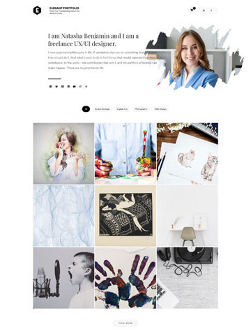
Elegant Portfolio
( 3 Reviews )
Free
Free
Free
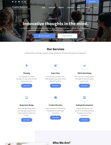
Creative Business
( 1 Review )
Free
Free
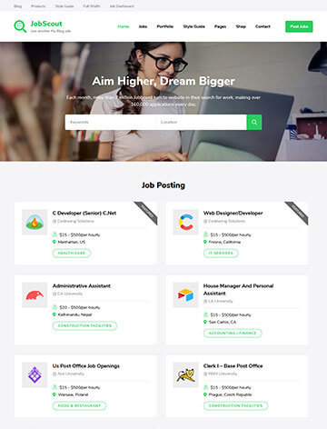
JobScout
( 4 Reviews )
Free
Rara Business Pro
( 16 Reviews )
$59
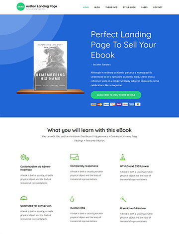
Author Landing Page
( 1 Review )
Free

Perfect Portfolio Pro
( 7 Reviews )
$59
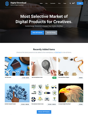
Digital Download
( 4 Reviews )
Free
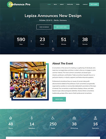
The Conference Pro
( 13 Reviews )
$59
Free
The Conference
( 13 Reviews )
Free
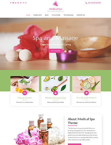
Spa and Salon Pro
( 10 Reviews )
$59
Software Company
( 3 Reviews )
Free
Free
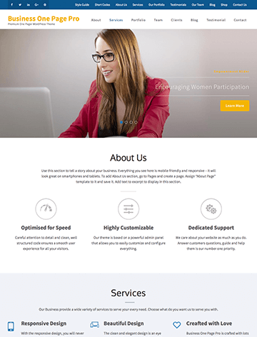
Business One Page Pro
( 6 Reviews )
$59
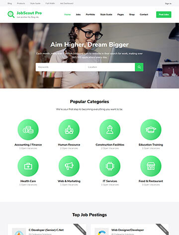
JobScout Pro
( 7 Reviews )
$59
Free
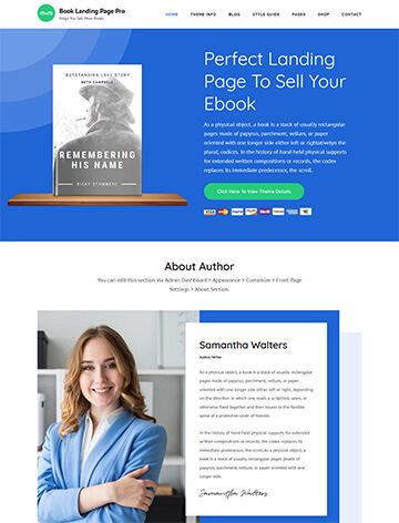
Book Landing Page Pro
( 7 Reviews )
$59

Travel Magazine
( 1 Review )
Free
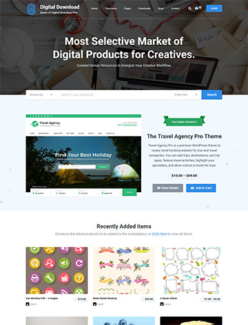
Digital Download Pro
( 15 Reviews )
$59
Free
Free
Free
Free
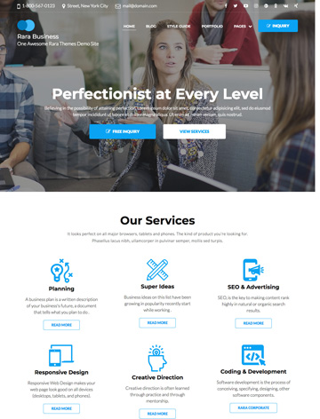
Rara Business
( 19 Reviews )
Free
Travel Agency
( 49 Reviews )
Free
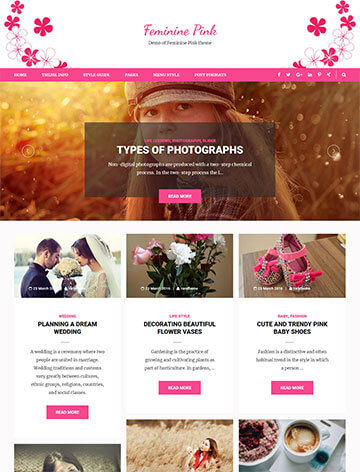
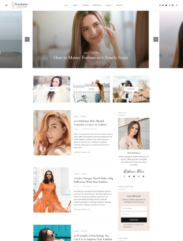
Feminine Pink
( 3 Reviews )
Free
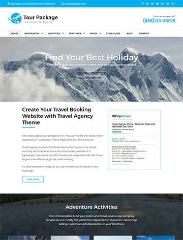
Tour Package
( 1 Review )
Free
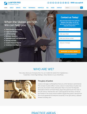
Lawyer Landing Page Pro
( 3 Reviews )
$59

Perfect Portfolio
( 14 Reviews )
Free
Rara eCommerce Pro
( 2 Reviews )
$59
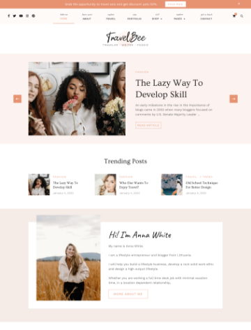
Travelbee Pro
( 1 Review )
$59
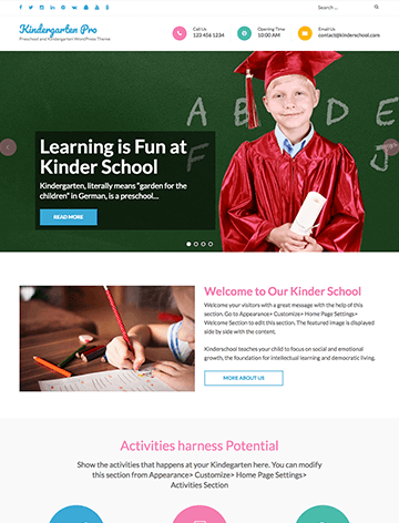
Preschool and Kindergarten Pro
( 7 Reviews )
$59
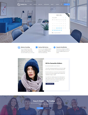
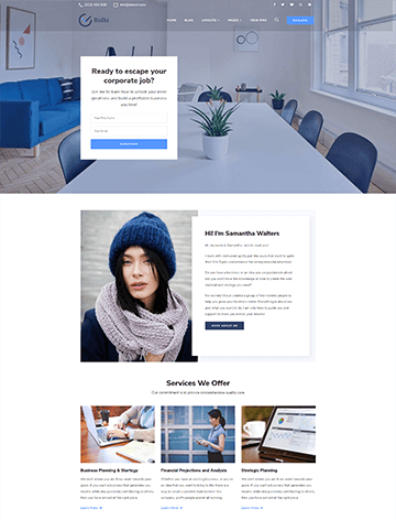
Ridhi Pro
( 8 Reviews )
$59
Business One Page
( 18 Reviews )
Free
Elegant Pink Pro
( 2 Reviews )
$59
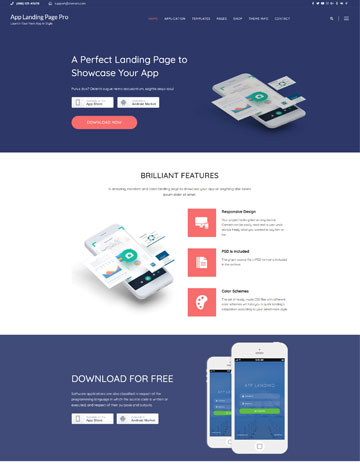
App Landing Page Pro
( 2 Reviews )
$59
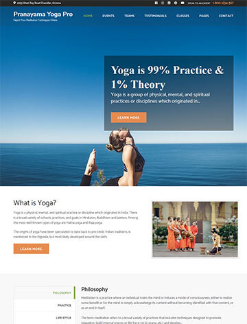
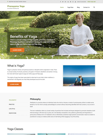
Pranayama Yoga Pro
( 1 Review )
$59
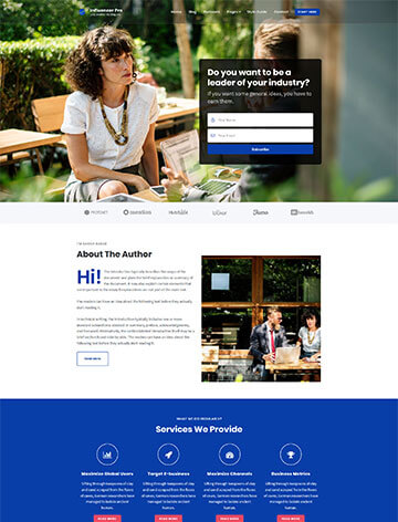
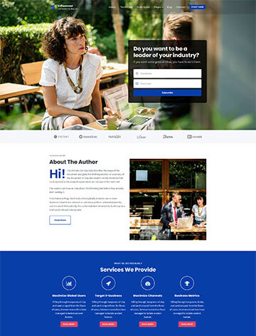
Influencer Pro
( 1 Review )
$59
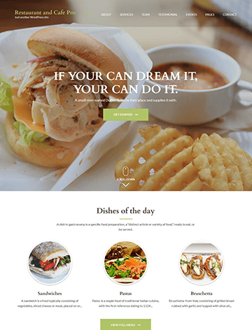
Restaurant and Cafe Pro
( 4 Reviews )
$59
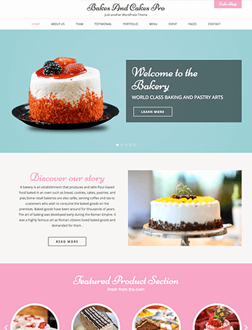
Bakes and Cakes Pro
( 7 Reviews )
$59
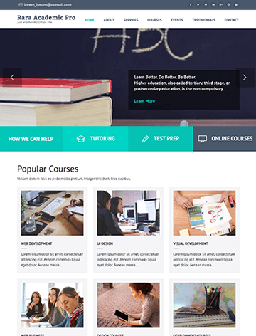
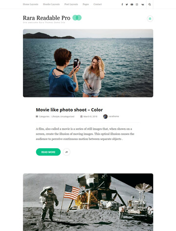
Rara Academic Pro
( 8 Reviews )
$59
Metro Magazine Pro
( 6 Reviews )
$59
$59
$59
Free
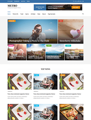
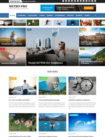
Metro Magazine
( 25 Reviews )
Free
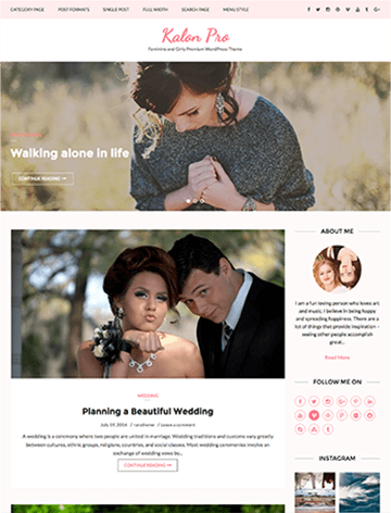
Kalon Pro
( 1 Review )
$59
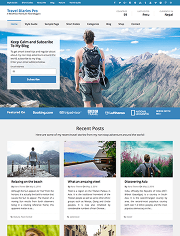
Travel Diaries Pro
( 3 Reviews )
$59
Preschool and Kindergarten
( 11 Reviews )
Free
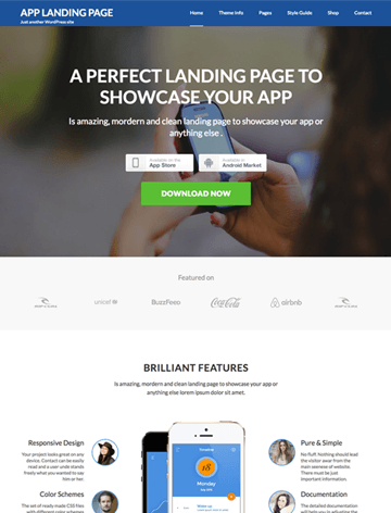
App Landing Page
( 1 Review )
Free
$49
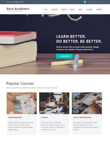
Rara Academic
( 8 Reviews )
Free
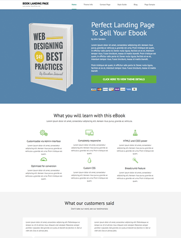
Book Landing Page
( 8 Reviews )
Free
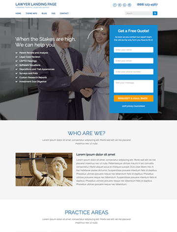
Lawyer Landing Page
( 17 Reviews )
Free
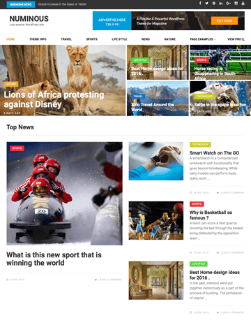
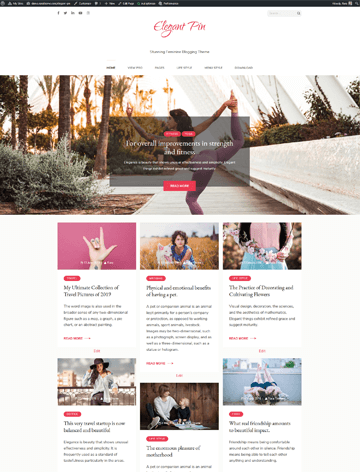
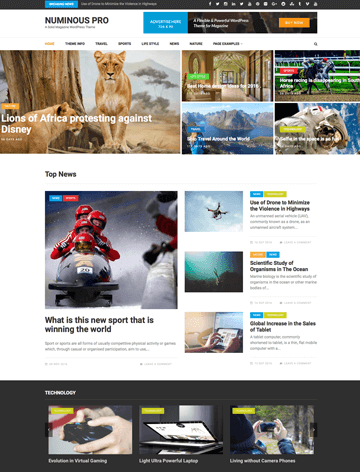
Numinous
( 5 Reviews )
Free
$59
$59
Benevolent
( 18 Reviews )
Free
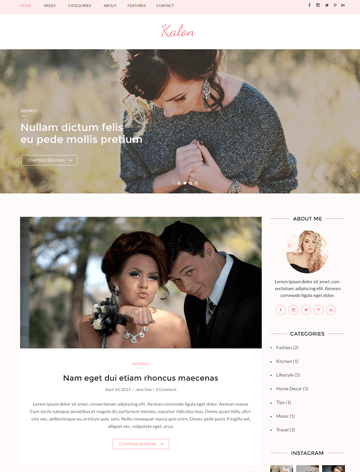
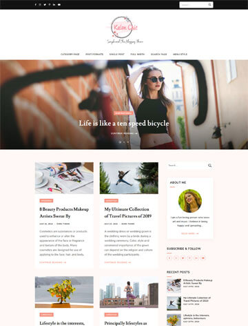
Kalon
( 3 Reviews )
Free
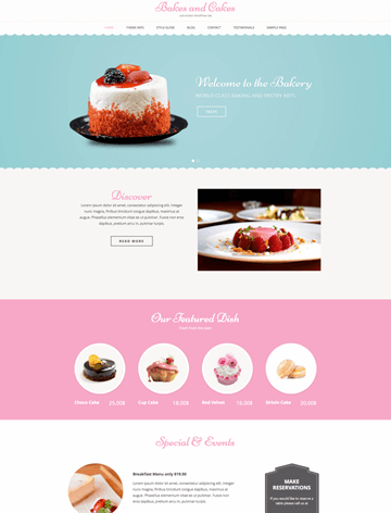
Bakes and Cakes
( 9 Reviews )
Free
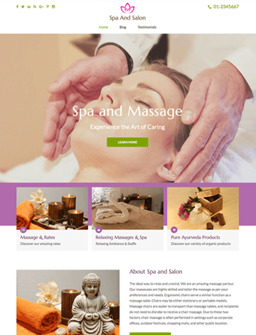
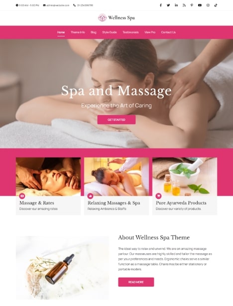
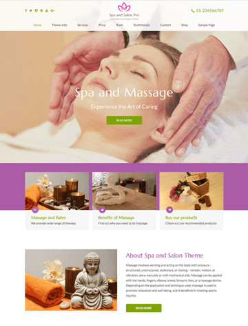
Spa and Salon
( 13 Reviews )
Free

Travel Diaries
( 4 Reviews )
Free
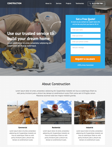
Construction Landing Page
( 16 Reviews )
Free
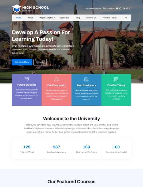
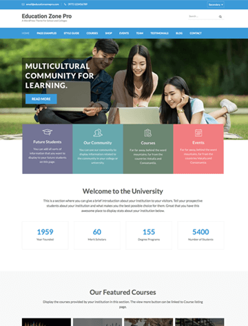
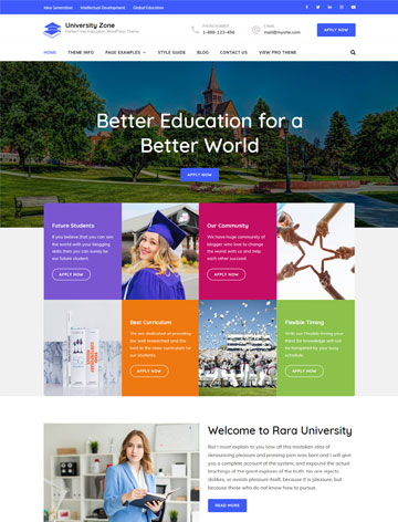
Education Zone
( 35 Reviews )
Free
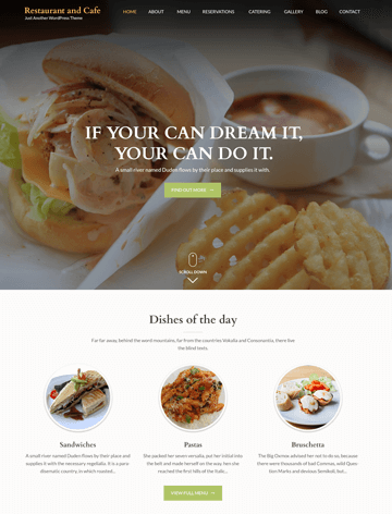
Restaurant and Cafe
( 13 Reviews )
Free
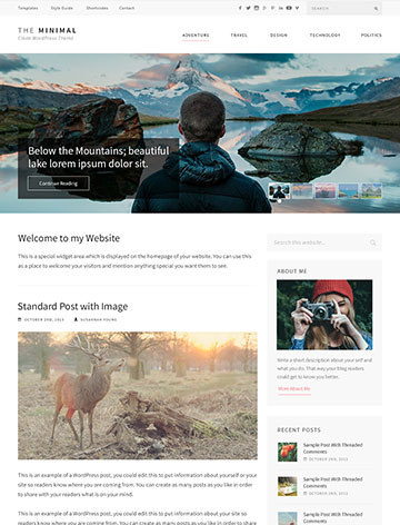
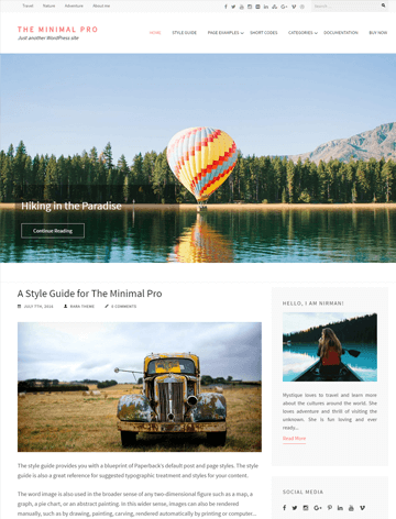
The Minimal
( 11 Reviews )
Free
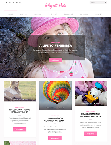
Elegant Pink
( 10 Reviews )
Free
Best Responsive WordPress Theme
As the online world gets more competitive, your website must look great on all devices.
Plus, with more people using smartphones and tablets to browse the web, a fully responsive website is no longer an option but a necessity.
This is where a Responsive WordPress Theme comes into play.
In this comprehensive guide, we’ll explore the world of responsive design. We’ll discuss why it’s essential and how to choose the perfect responsive theme for your website.
What is a Responsive WordPress Theme?
A Responsive WordPress Theme automatically adjusts its layout and content to fit various screen sizes and devices. This ensures your website looks and functions great on all devices.
Key Features of a Responsive Theme
Here are some features you can consider when choosing a responsive WordPress theme:
- Flexible Grids and Layouts: Responsive themes use flexible grid layouts that adapt to the device’s screen size. This means columns, images, and other content elements resize and reposition.
- Adaptive Images: Responsive themes appropriately scale images based on the device. This prevents images from being too large on smaller screens or too small on larger screens.
- Media Queries: Media queries are a way to make websites look good on different devices, like phones, tablets, and computers. They help change the way a website looks depending on the screen size. This allows the theme to provide tailored layouts for different devices.
- Touch-Friendly Navigation: Responsive themes are designed with mobile users in mind. Thus, they offer touch-friendly navigation menus, buttons, and sliders. This ensures that your site is easy to navigate on touch devices.
- Cross-Browser Compatibility: A responsive theme ensures your site performs well across all browsers. This is crucial for providing a consistent user experience.
Why a Responsive WordPress Theme is Essential for Your Website
Most traffic comes from mobile devices, so a responsive website is essential to reach a broader audience. Here are the main reasons why a Responsive WordPress Theme is essential:
1. Improved User Experience
User experience is a significant factor in the success of a website. If your site is not responsive, mobile users may struggle with navigation. This can lead to higher bounce rates.
- Smooth Navigation: Responsive themes offer intuitive navigation. This ensures that menus, buttons, and links are easy to use on any device.
- Readable Content: Text is automatically resized and formatted for readability. This will cut the need for users to zoom in and out.
2. Better SEO Performance
Google has made mobile-friendliness a significant factor in its search ranking algorithms. Unresponsive may rank lower in search results, especially on mobile searches. A responsive WordPress theme helps improve your site’s SEO performance. This makes it more likely for you to appear at the top of search engine results pages (SERPs).
- Mobile-First Indexing: Google uses mobile-first indexing. It primarily considers the mobile version of your site when determining rankings. A responsive theme ensures your site is optimized for this.
- Lower Bounce Rates: Responsive themes reduce bounce rates by providing a better user experience. This can positively impact your SEO rankings.
3. Increased Conversion Rates
A seamless user experience on all devices can lead to higher conversion rates. Whether your goal is to capture more leads or increase conversions, a responsive design makes it easier for users to take action.
- Accessible Call-to-Actions (CTAs): Responsive themes ensure that CTAs are prominent and easy to click on all devices. This increases the likelihood of conversions.
- Consistent Branding: A responsive theme maintains consistent branding across all devices. This is essential in building trust and encouraging conversions.
4. Future-Proofing Your Website
As technology evolves, new devices with varying screen sizes are introduced constantly. A responsive WordPress theme adapts to these changes. This ensures your site remains functional and appealing no matter what the future holds.
- Scalable Design: Responsive themes are built to scale, so your site will continue to look great as new devices and screen sizes emerge.
- Cost-Effective: By using a responsive theme, you avoid the need for separate mobile and desktop versions of your site. This saves time and money on development and maintenance.
How to Choose the Best Responsive WordPress Theme
With countless themes available, choosing the right one can be overwhelming. Here are some tips to help you find the best Responsive WordPress Theme for your needs:
Prioritize Speed and Performance
A responsive theme should not only look good but also perform well. Check the theme’s loading speed and performance metrics to ensure it won’t slow down your site. Faster loading times improve user experience and can positively impact your SEO.
- Lightweight Code: Choose a theme with clean, lightweight code that doesn’t bog down your site with unnecessary scripts or features.
- Optimized for Speed: Look for themes that are optimized for speed. Look for features like lazy loading, which delays the loading of off-screen images until visitors need it.
Test the Theme on Multiple Devices
Before settling on a theme, test it on various devices, including desktops, tablets, and smartphones. Ensure the theme’s layout, images, and navigation elements adjust correctly across all screen sizes.
- Cross-Device Testing: Use online tools or physical devices to test the theme’s responsiveness on different screen sizes and orientations.
- Browser Compatibility: Ensure the theme works well across different browsers.
Look for Customization Options
The best responsive themes offer a range of customization options, allowing you to tailor the design to your brand’s needs. Look for themes that provide a built-in customizer, drag-and-drop page builders and many layout options.
- Theme Customizer: Choose a theme with a built-in customizer. This allows you to change colors, fonts, and layouts without touching any code.
- Page Builder Compatibility: Opt for a theme compatible with popular page builders. Builders like Elementor and WPBakery give you more control over your site’s design.
Check for SEO-Friendliness
To ensure your site ranks well in search engines, choose a theme built with SEO best practices in mind. This includes clean code, fast loading times, and built-in support for schema markup.
- SEO-Optimized Code: Look for themes coded with SEO in mind, with features like clean HTML5 and proper use of heading tags.
- Schema Markup: Some themes come with built-in support for schema markup. This helps search engines better understand your content.
Read Reviews and Ratings
Before making your final decision, read reviews and ratings from other users. This can provide valuable insights into the theme’s performance, ease of use, and customer support.
- User Feedback: You need to pay attention to user feedback. This will give you an idea of the theme’s responsiveness, speed, and customization options.
- Support Quality: Check if the theme developers offer reliable customer support if you encounter any issues.
Top Responsive WordPress Themes to Consider
If you’re looking for a Responsive WordPress Theme, here are some of the top themes that combine aesthetics, functionality, and ease of use:
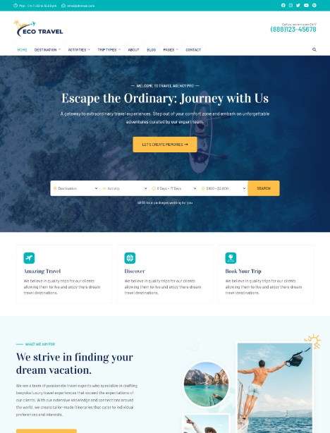
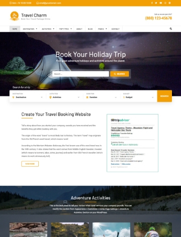
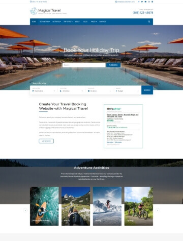
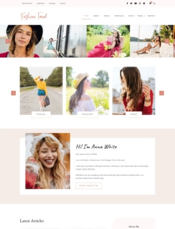
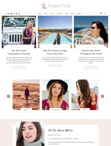
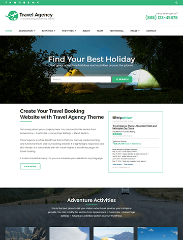
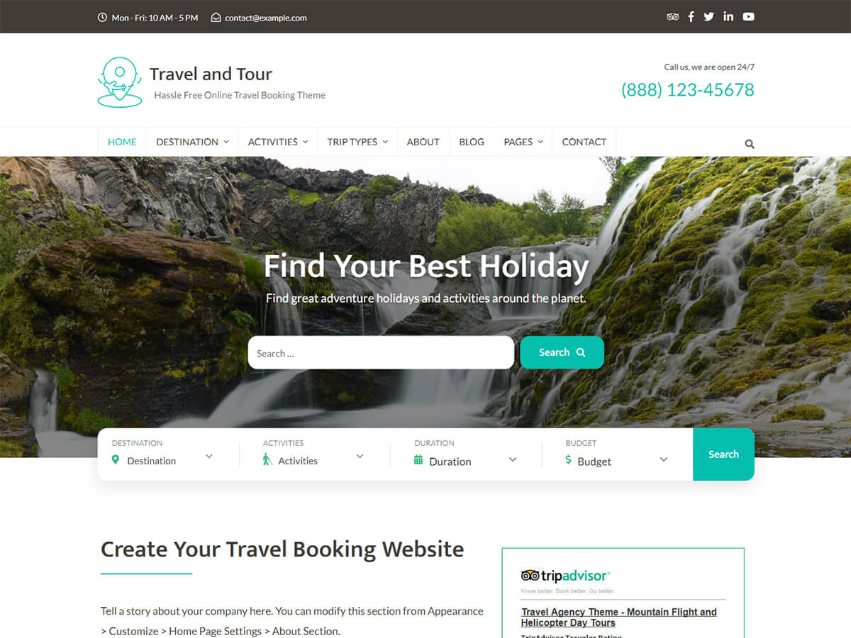
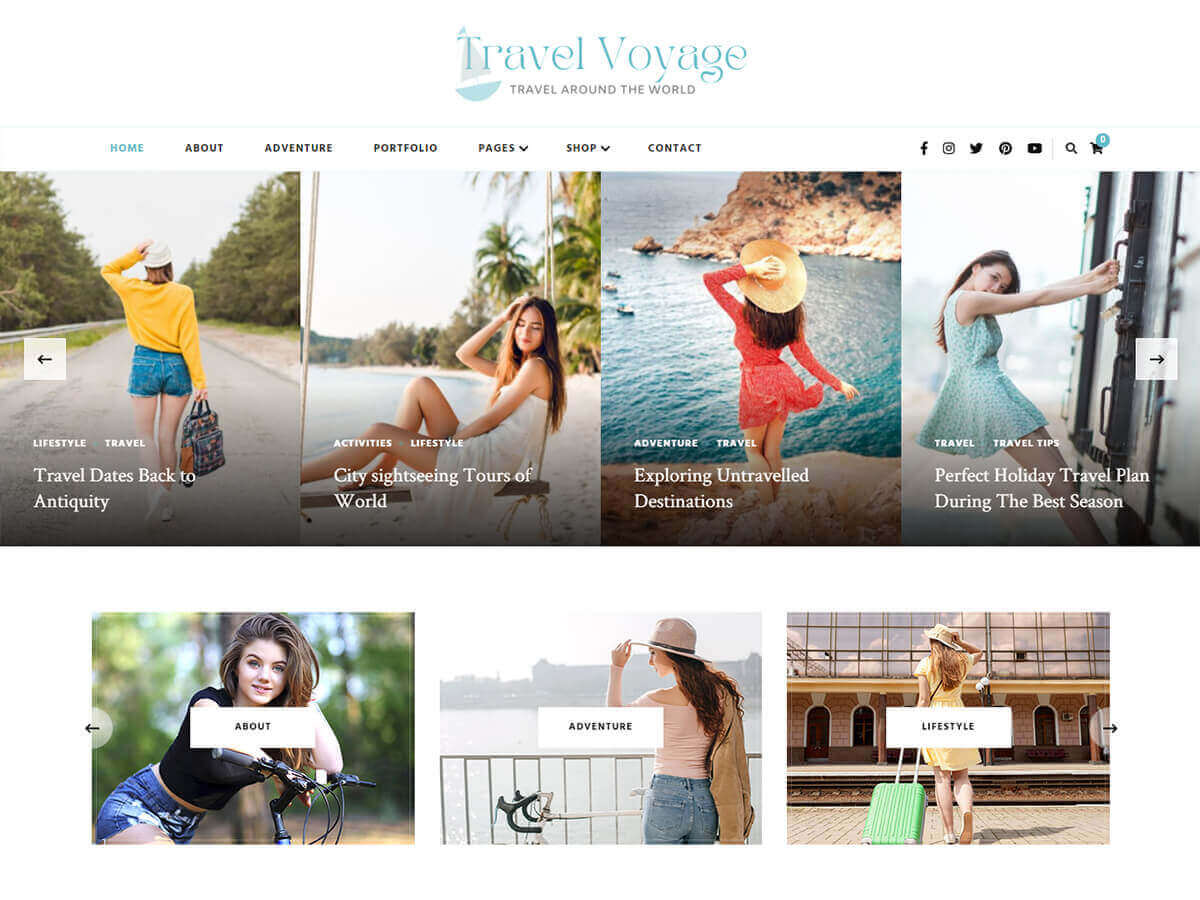
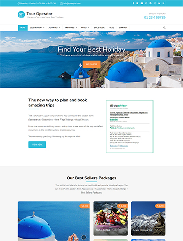
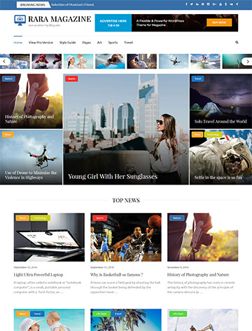
Travel Agency
Travel Agency is a free WordPress theme designed to build a travel booking website for tour and travel companies. With this theme, you can easily add trips, destinations, and trip types, showcasing travel activities and specialties.
Travel Agency also optimizes speed and SEO and is 100% responsive. This makes it an ideal choice for an engaging, user-friendly site.
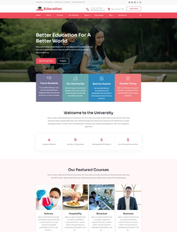
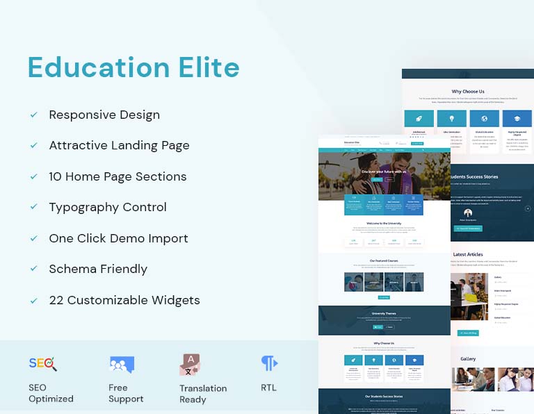
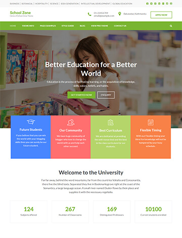
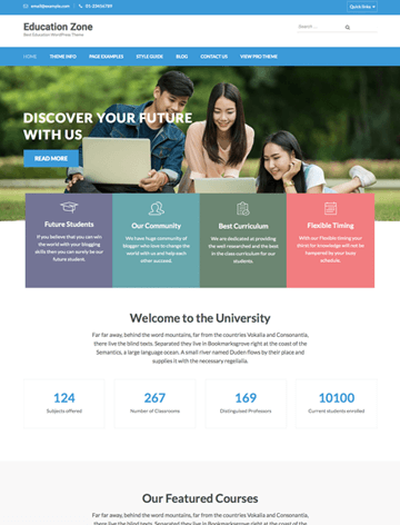
Education Zone
Education Zone is an easy-to-use WordPress theme crafted for educational institutions. It helps you showcase your institution with a fully functional website without hiring developers.
This free theme is responsive, SEO-ready, and schema-friendly for better search engine rankings. It is also very customizable. This lets you add a personal touch to your site, creating an engaging visitor experience.
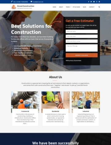
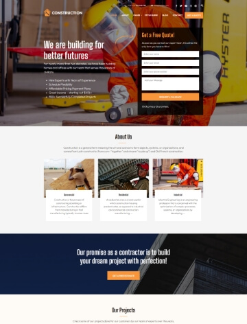
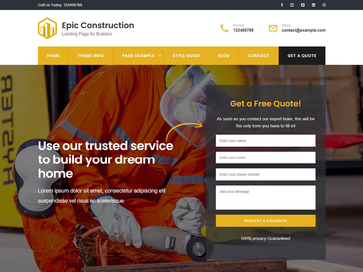
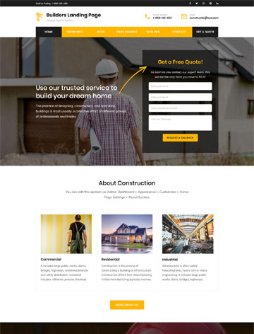
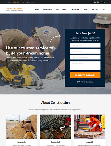
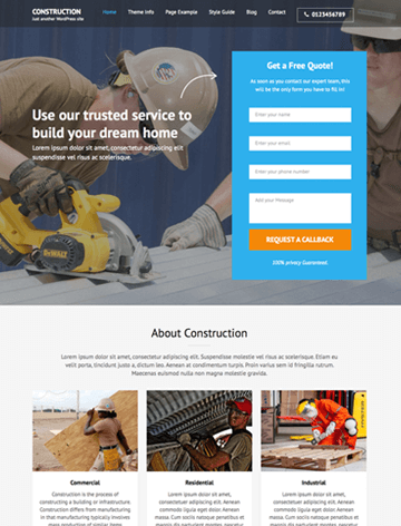
Construction Landing Page
Construction Landing Page is a lead-generating theme that is perfect for owners of construction-related businesses. This free theme lets you create a professional-looking website without coding skills.
It’s fully responsive, so it works smoothly across all devices. The theme is SEO-optimized and speedy. It also provides an intuitive interface for both users and admins.
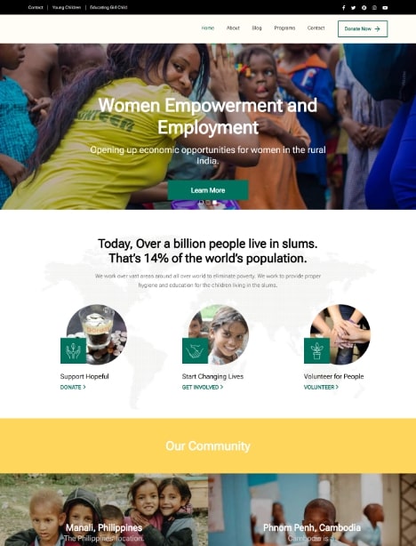
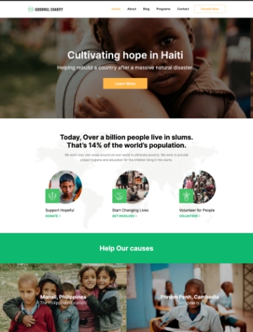
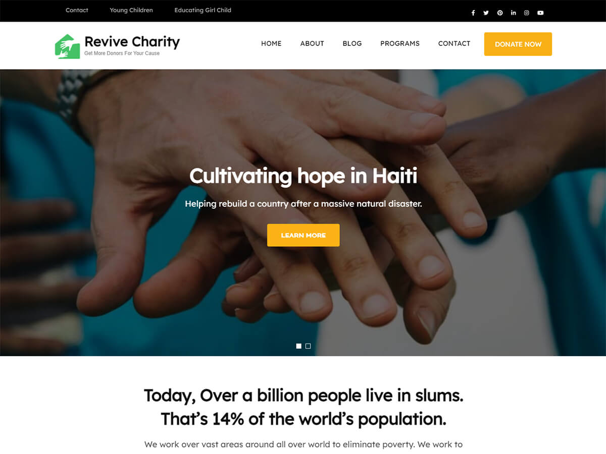
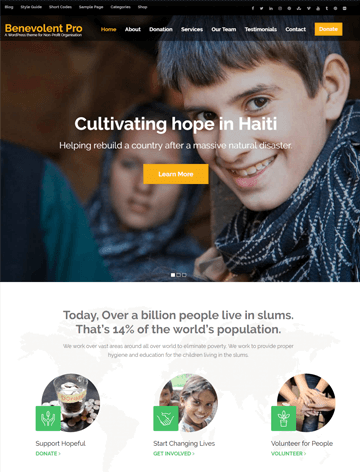
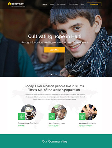
Benevolent
Benevolent is a WordPress theme created for charity organizations. You can design your website without coding knowledge. It features a responsive layout that ensures smooth performance on any device.
The theme is SEO-ready. This helps your charity rank higher on search engines. Additionally, it also includes social media integration to extend your reach. It also supports easy translation for multilingual visitors and offers prompt expert support for questions.
Rara Business
Rara Business is a free, mobile-friendly WordPress theme optimized for speed and SEO. This makes it ideal for building a clean, professional website.
With no coding required, this theme makes it simple to create an eye-catching site that stands out. It includes various useful sections and SEO-friendly features, making Rara Business perfect for companies looking to strengthen their online presence.
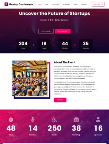
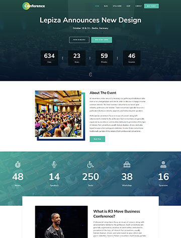
The Conference
The Conference is a free WordPress theme for creating a responsive, SEO-friendly website for events or conferences. Whether planning a seminar, symposium, or concert, this theme helps you sell more tickets with an attractive design and engaging features.
Simple to use, The Conference enables you to build a professional website quickly without any coding experience, keeping visitors engaged and increasing conversions.
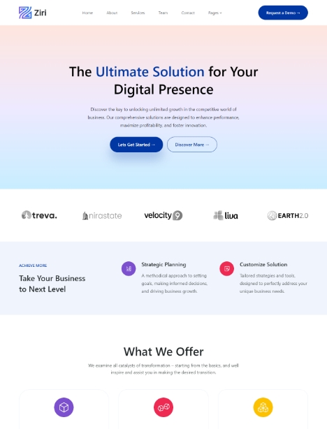
Ziri
Ziri is a full site editing (FSE) theme optimized for core web vitals. The website is great for business owners, digital agencies, and bloggers.
The theme offers the one-click demo import option, which allows you to import the demo content with a click. You can then customize the content according to your branding.
Make Your Website Future-Proof with a Responsive WordPress Theme
Choosing a responsive WordPress theme is crucial for creating a website that looks great and performs well on all devices. Focus on speed, device testing, and SEO for a successful website.
A responsive theme is a wise investment for your website. It ensures your site looks great on all devices, making it accessible to more people. Start exploring responsive themes today and create a visually appealing and future-proof website.